Wednesday, 30 November 2011

Shoot One - On Set Photographs

Words by James Bolton.

In this post I have included some still images that I took on my mobile phone while we were on set at the office shooting the first sequence of our music video. The pictures include us setting up the costume, filming various shots from various positions as well as taking pictures on the stills camera that will later be used for our CD Digipack.
Alex played the part of the main character, while myself and Andy filmed the shots, directed Alex and also featured in the background for the lengthy shot that we will speed up so the background is moving quickly, while Alex appears to be moving at normal speed.


Clockwise from above: Top left - Alex preparing his costume
Top right - I film a close up tracking shot of Alex
Bottom - Andy takes some photographs for the CD Digipack


Clockwise from above: Top left - Me and Andy review some of the CD Digipack shots
Top right - I frame the shot correctly for the CD Digipack allowing head room etc
Bottom - Andy practices photos from a possibly location in the office

Monday, 28 November 2011

Successful Shoots

We have now filmed our first two shoots for our music video. The first shoot that we carried out was filmed at the Siemens office in Wollaton (Andys Dads work), this shot was for the office scences of the music video. These shots will all be used towards the start of the music video as they are the day time scence while our main character is at work. The most important of these shots that we filmed was the shot which we will speed up. This is where the character is sat at the office desk working and everyone else is moving very quickly behind him. This effect is to imply that he feels as if time is going slow and that he cant wait to finish the day and begin his double life. We think that this shoot went very well as we got all the shots that we needed and also some other shots that we just tried out on the day.

The second shoot that we have now filmed is the performance elements of the music video, this is probably the most important and challenging part of the video as with performance filming you have to make sure that the lip sinking is correct as well as other featurs such as the other band members and all the other things that you would have to consider when filming any shoot such as lighting, white balence, focus etc. We shot the performance at The Crown pub in Awsworth. On this shoot we got around about 40 minutes worth of footage, not all of it will be useful but we think that will this amount we will be able to get the right shots.

When we have edited some clips of both of the scence we will upload clips to the blog to show our progress. We think that we may be filming our final scence on the 17th December but we are yet to confirm this. On this shoot we will be filming the rest of the narrative side to the performance, this will be the part where the character breaks into the house, it will also include the stop motion part where the tie is being removed.

Directors Cut - Shoot 1


This is the directors cut that we recorded before we filmed on Saturday, in this we briefly explained what we had planned to film on that day. On Saturday we filmed all the shots for our office/work scene, this included one of our main and most important shots, the sped up shot. We also filmed shots of our main character walking to and from his desk and also in and out of work. We felt that this shoot went well as we successfully got all of the shots that we had planned to film, we also got a few extra shots that we tried out just to see if they would work any better than the ones we had planned in our shot list. On this shoot we also took some photos which we are planning to use on the CD cover, we also took some photos of ourselves filming and setting up the camera and equipment which we will be uploading to the blog.

The next shoot that we have planned is the performance section of the song, we are going to be filming this at the pub skittle alley tonight. We have all the equipment booked including drums, microphone, guitar, camera, tripod and some other smaller items.

Friday, 25 November 2011

Making The Height Chart

To go with the mug shot boards that we have already made, we had to make a height chart that would be the background for various shots on the website, CD digipack and for in the video itself.
To make it, I found a long roll of paper and start at 6 foot 6 and went down in gaps of 3 inches, but still leaving room at the top and bottom so it would take up the whole shot. I used a thick black font so it would be easily readable and did 3 different charts along the roll. I did this in case it would be easier to take the image for the background of the website with all three of the band members in shot, rather than taking 3 individual photos and merging them together.


Above are photos of me making the chart as well as one of the final outcome. We will take this on our shoot on Monday along with the boards.

Making The Mug Shot Boards

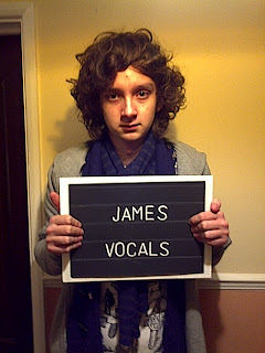
In preparation for this weekends shooting we have been making the props for the mug shots. Originally we were unsure whether we would print the boards in order to get our chosen font exactly right, however, when I went to the stationary shop to look for black paper, I found a white paint pen and some stencils, so I thought we could test that first and hand write them rather than printing them off of the computer. I also located some chalk boards slightly larger than A4. I coloured in the edges of them white so there was room to stick the A4 paper onto it. It would also give the boards a rigid look, rather than the character just holding up a piece of paper, they will be holding something that is fair close to the real thing.

Resources for making the boards: Paint pens, letter stencils, black paper, black chalk board, rule and white crayon.

Myself and Andy made the boards. We ruled lines across the sheets of paper in order to create the appearance of slots (where letters are usually pinned on mug shot boards). We then stencilled the letters and drew over them using the paint pen. We made 9 in total, 3 for website, 2 for the CD Digipack and 4 for the video itself. The photos below show myself and Andy making the boards.


Below are some test shots that I took on my mobile phone to see if the boards look appropriate and to see if our idea worked. The photo on the bottom is the equvilant of the part of the background image for the website, and the photo on the top is the back of the digipack. I think that the boards have worked well and they look very realistic. For both photos, the height chart will be behind, I will explain that in another post.

Thursday, 24 November 2011

Weather For Shoot

I have checked the weather for Saturday 26th of November because we're filming that date and a small section of our film is going to be filmed outside. The weather for that day is sunny and cloudy with rain late at night, as we're filming in the morning it'll be fine for us to film without rain if the forecast is correct.

Saturday's weather forecast
That's good for our filming as it makes camera shots and editing a lot easier without having to worry about the continuity of the rain. If we were to refilm a certain shot we'd have to make sure we did it on a day with similar weather conditions.

Main Character's Costume - Office/Day Time

The main character is going to be working in an office for the first part of the video, before he changes into the outfit that he will rob the house in ("Double Life Begins"). For the scenes in the office, and the stop motion sequence, the character will have to wear a shirt and tie to fit with the fact he is obviously at work.


Left: White shirt, blue tie.
Right: Red shirt, black tie.

Costume Arrival

Today, the balaclava that I ordered arrived in the post in plenty of time for shooting this weekend.

Left: I tried on the balaclava, and it is giving us the right look for the character of the robber.
Right: The balaclava.

CD and Digipack Font Research

As I am responsible for the CD and digipack, I am doing some research into the fonts that can be used. The text we have on the CD cover is:
  1. Front Cover - Band name and song name on the board.
  2. Back Cover - Track listing on the board
  3. Inside Cover or 4th Side - Possibly the lyrics to the song.
It is important we recreate the font that "The Futureheads" use when they display their name, in order to fit with the style and image of the band. Below is a screenshot of the band's website and a copy of 4 of their CD covers, that I made when looking at the bands image on a previous post.


As you can see, the band name is in a simple, black, block font. By clicking on the images, you can see, particularly on the website, that the font has a slightly worn and faded look. Therefore, I found this font on UrbanFonts.com, and thought it was a fairly close match. It is called "Dirty Headline".


I think this font would be appropriate for the website, but maybe not for elements of the CD cover. The font needs to be appropriate for the mug shot board that will be held up. This font will feature on not only the CD cover, but the website background image and in the video itself, when the character holds up the board, displaying four different lines of lyrics, as demonstrated on the following blog post.

I therefore have found a selection of fonts that I think would be appropriate ones to copy and recreate to go on the mug shot boards. The target font can be seen below in this example mug shot photograph. It is still a block sans-serif (without flicks) font but with thinner lettering.
Click to enlarge.
Here are the possible fonts, found from another font website DaFont.com:

Old Sans Black
Of the four suitable fonts that I found, I think either Old Sans Black or Tratex would be the best, because the letters are not taller than they are wide, as in the above mug shot. However, if it is difficult to perfectly recreate these fonts, a block, sans serif font with thin lettering will fit with the conventions and image we are trying to create.

To make the 9 boards we need, we will probably print out the lettering but with black background and white text, and attach it to a black sheet of paper, which we then attach to a black chalkboard, so it is rigid, easier to hold, and more realistic to look at.

Evaluating Last Year's CD Covers and Digipacks

In order to help us with the development of our own CD and Digipack, I am going to look at some examples from last year's students work, evaluate their strengths and weaknesses, compare them to the marking criteria and see what final mark they received.


1. Party In A Forest - The Wombats


This digipack was given level 4, which is 9/10 or 10/10. This is mainly due to the fact that they have strong original images (of the forest and of the band) and they have integrated the images and text together well. It is important that the cropping is clean and they have created a professional look the way they that cut the band members out on the front cover. Having seen their music video, there is a clear link between the two and they are instantly recognisable as the same song by the same band. They have stuck to the obvious conventions by having the band and track name on the front and have also managed to include the song's lyrics in the digipack. They have also used a variety of fonts and have used the font that the real The Wombats use on their CD covers, which makes the digipack look even more authentic and professional. The only thing that I feel lets down this digipack is the band image. I dont feel that the three actors on the front fit in with the style of an indie band or the image of The Wombats.

2. Triangle Walks (Rex The Dog Remix) - Fever Ray


This is another digipack that achieved level 4 and either 9/10 or 10/10. Again, like The Wombats digipack above, they have their own original images throughout of the forest, main character and the giraffe. The images have been cropped and edited appropriately, especially the image on the inside of the digipack, which is the picture of the forest, which has been changed to black and white as well as being slightly distorted to give a sort of fish bowl lens effect. They have also added the strands of light using photoshop, which fits with the dance genre of the video. Although they haven't got the name of the song and artist on the front of the CD, they have included a track listing on the back, which fits with conventions. The character, woodland setting and giraffe (which is a mask worn by someone in the video to create the surreal feel) are instantly recognisable if you have seen the video and vise versa. This is a key in achieving successful intertextuality and integration of both the digipack and the music video.


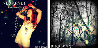
3. Bird Song - Florence and the Machine


This digipack achieved level two in the mark scheme, which is between 4 and 6 out of 10. This digipack actually achieved 5/10. The strengths are that they have their own original images and these relate to the video, which is a good use of intertextuality and they have been edited well to create the querky look that is appropriate to the artist (Florence + The Machine). Unfortunately, what lets them down is the fact there is not a variety of font sizes, and they haven't stuck to the conventions of digipack layouts. They don't have a clear track list unlike the digipacks that achieved level 4. They also don't have the essentials such as a barcode etc. The image of the character (or singer), is duplicated or certainly very similar, the distances have just changed. This means there isn't as much originality as the same idea has been used for two sides of the CD. That is why we don't want to duplicate any images on our digipack. The fourth face (bottom right) also isn't very creative or original, it is just black background with the words "Tweet, Tweet, Tweet."

Wednesday, 23 November 2011

Evaluation Of Last Years Students Work

At the start of the year we looked back at the previous years students work and evaluated them to help us try and understand what makes a bad music video, and more importantly, what makes a good music video.

Glee - Vogue - Click here to see the video

This video was the worst video of the year and it was really something that we would not like to replicate.  It was filmed at College behind the back of the gym and it was half black and white and half not, it looked like they'd spent a very short amount of time on it. The only positive that I can pick out of it is the fact that it fits the fashion theme that they were aiming for.  They also tried to do lots of shots, but they weren't shot with good quality and they were too long. The acting was shameless, but it was inept and the lipsynching was embarrassingly out of time and in some cases it was seconds late. It looked like it was filmed in one afternoon and like it was really badly planned, that's something we've done meticulously so we shouldn't have that problem.

Predicted mark: 15/40 
Achieved mark: 15/40


The Pippette's - I Like Boys In Uniform - Click here to see the video

This is a very good music video, which achieved a very high grade and fit all of the conventions of a good music video. It also fit with their song very well which is why is why it received such a good grade. It is also acted extremely well and even though it's not graded on strength of actors, the confidence of their performers really shone through and made their video so good. The lipsynching is something which is marked and that was flawless in this particular video, which is something we'd like to replicate. The video also has a very well thought through narrative that fits with the song that they've chosen excellently. It also has a wide range of shot types which is something which is in the mark scheme, the shot's are all well framed and shot very well which is another reason why this particular video was so good.

Predicted mark: 37/40
Achieved mark: 40/40

Example Of Sped Up Shots

This is a music video that was made by students from Bilborough College last year, I have uploaded this video because it is a good example of what we want to achieve with the scene in the office where we are going to speed the shot up in the editing process. We are going to have a similar shot where the main character in the shot is still or very slow and everyone else in the shot is moving very fast. In the video shown below they have used this effect to show that the character is lost or confused, where as in our video  we are using the effect to show that the character wants to get out of his work and that he can wait for the day to end and the night to begin, this will match the lyrics of our song. Click on the link below for the video example, the shot which has been sped up is at 2:16 in the song.

Arctic Monkeys - This House is a Circus

Reply From Siemens

Siemens have replied to us regarding the use of their office for the filming of our music video. They have said that everything is fine to film at their office and we can go ahead with our filming on Saturday 26th of November. We've spoken to our actors also and they're happy to film that day and transport will be sorted in the next day.

Twitter Link Made - Website

Twitter Link
This is the Twitter link that I have made for our website. When it's clicked on it takes you direct to The Futureheads official twitter account. It was pretty simple after looking at the tutorial which I posted a couple of days ago, here. You basically just have to crop the picture and format it how you want it to look like, by using the Photoshop software on the Macs.

Once you've got the image that you'd like to hyperlink you need to click on the inspector tool which bring up the box you can see above. Then you click on the far right hand side and I put a link to the official Futureheads Twitter and enabled the hyperlink so that when you click on the picture it takes you to their Twitter.

How to make a CD Cover using Photoshop CS3 - Tutorial


Above is a two part Youtube tutorial about how to make a CD cover. It talks through colour schemes, the lasso tool (a form a of detailed cropping), resizing images and piecing together different layers on different images. Obviously, this video just talks through the front of the CD, but as we are making a digipack, I will have to repeat this for 3 or 4 images to fit on each side of the digipack.

Costume Element Ordered

I ordered the winning balaclava from eBay yesterday (Tuesday 22nd) and it is due to arrive in time for shooting on Monday 28th.

Screenshot of the eBay page. (Click to enlarge)

Costume Poll

In order to help us decide which balaclava would look the best for our main character, I thought we could use the tools on blogger and get our classmates to vote. This is a good method of interaction and would assist us in choosing our costume.
Setting up the poll using the Blogger poll gadget.
The results from our poll are as follows:

The clear winner was option 2 - the balaclava with two eyes and one mouth - with 11 of the 13 votes. Option 3 - with one hole for both eyes - received 2 votes and the other two options received 0 votes.
I will need to order the balaclava in time for shooting, now we know which one we're going to use.
The winning entry.

Monday, 21 November 2011

Last Year's Website Analysis

I've looked at last years websites from other Bilborough College students to help understand what I need to do to create a website which can achieve a high grade. I've looked at websites which are a mixture of grades ranging from excellent to average.


Dinosaur Pile Up - Joseph Ree-Jones, Antonio Panzera, Elliot Newton

This is the first website that I looked and it is very good and hits everything needed in the marking criteria, which is why it achieved a Level 4 and 10/10. The website has a strong house style all the way through the website and it sticks the colours of green and black which go very well with the style they're trying to achieve.

The website also has suitable use of technology with Twitter, Facebook,Youtube and Myspace, they all fit with the style of the website as they have the same modern style. It also has a range of different font styles and sizes which is something which is necessary to get a Level 4. They also have pictures from their filming which is mainly performance which is also a good touch to their website.
This is the website
Mark - 10/10 Click here to the see website

Christina Perry - Sharonjeet Meht, Ashley Wilks, Alex Graham


This website is of a different genre to us, but it has all the conventions of a good website. The website has a very good background which sets the tone for the whole site. It really fits with the song they did and it was a picture which was taken during the filming of the video, that's why we'll be taking a stills camera to our shoot.

The website has both Twitter and Facebook links on it, which is a common thing on a website nowadays, they also have links to iTunes where the song can be purchased. The only problem I have with this website is the written content which is on it, it only has a small amount of writing which isn't very realistic, which may have been why it wasn't 10/10.

This is the website.
Mark - 9/10 Click here to see the website

Website Fonts

In the mark scheme for the website it says that the website must have a range of different fonts and font sizes, this is something I was keen to look up early to make sure we have the right fonts which fit the look that we're trying to achieve. There are two websites which I'm going to use to look for fonts on, both Urban Fonts and DaFont are useful for this work.

Looking at The Futureheads previous work they mostly use block writing on there website and their CD covers as they seem to be a band that likes to keep it simple, but effective.
The large block capitals are very noticeable
Because of that we've decided we should replicate The Futureheads to make sure that it fits in with the target audience we're aiming too. Also it means it would not look out of place if it was a Futureheads website.

Amarillo Usaf
This is the first font which I feel would be suitable for our website. It's in block capitals so it'd look similar to a Futureheads font. It's a bit thinner than the font on the Futureheads website shown above but it would be either good for the navigation bar or headlines of the main site.

Atrox
This is the second font which I've looked at as a possible font for the website. It's very much like the current Futureheads font and I think it's a very good fit for a band of our genre. It stands out a bit more than the first one which is important, so it would be good for the main band name.

Blockbusted
This is another possible font for our website. I feel that this font is the font inbetween Amarillo USAF and Atrox seen above. It's bold but it's not as thick as Atrox and it is not as thin as Amarillo USAF. This personally is my favourite font of the three, and I think it would fit well on the website we're aiming to make.


Alex Beale - Evaluating Previous Students Work

Below is the link to two examples of previous students work that I evaluated for the planing and research stage earlier on in the course. For this we had to look whether the videos included performance elements, narrative elements, conceptual elements, visuals that match the music and the lyrics. We also had to look at the main strengths and weaknesses, whether or not in met the conventions and expectations of the bands image and genre. For the first video we guessed that it would be given 25/40 as there is quite a lot missing that should be in a music video, its actual mark is 31/40. For the second music video we guessed at 33/40 because we felt it was better than the other one as it looked a lot more professional, the actual mark was 29/40. Both of the music videos included performance, narrative and visuals that match the music and lyrics. For the full evaluation of the previous students work click here.

1. Wombats - Party in the Forest 


2. Florence and the Machine - Howl


James Bolton - Evaluating Previous Students Work

At the very start of the planning stage, we evaluated some previous students work in order to determine whether it was narrative, conceptual, performance etc as well as writing down its strengths and weaknesses and giving it a mark out 40, based on the mark scheme.

Below is a more in depth evaluation of the two videos that I looked at. (Click the link to see video)


This video is a narrative and performance video. The performance section is strong, because the musician they are using  can actually play the song, which makes the video look very authentic. Unfortunately, while the playing of the guitar is good, there is no lip synching in the video, which I think would have made the performance almost perfect. In the narrative they have the stereotypical 'boy and girl' story, but the chance of it being corny is avoided by the song's meaning. This means that the lyrics fit well with the visuals. Also, the video had a wide range of shots, which is a key section of the mark scheme. In addition, the image of the artist was correct, and the black and white colour scheme added a very indie feel.
Estimated mark - 33/40 (L4)
Actual mark - 29/40 (L3)


This video is a narrative, conceptual and performance video. Again, this video follows the typical boy/girl narrative, but they have added a unique twist by painting faces on their stomachs, rather than seeing the person's faces. This is a quirky idea that fits with the indie genre and is a new take on the boy/girl theme which has been seen time and time again in music videos. The performance section was strong, as there was lip synching as well as the singer playing the guitar. However, the location for the performance is quite poor as it is just a room in front of a curtain. If they had found a better location, the performance section might have been more interesting. Also, there wasn't a massive variety of shots, and the video mainly consisted of medium shots of the stomachs, which probably let them down.
Estimated mark - 33/40 (L4)
Actual mark - 30/40 (L3)

Wordle

This is the word cloud or 'Wordle' for The Futureheads, I put text from a review of the album The Chaos from a website called 'Drowned in Sound'. As you can see the word cloud shows basically what The Futureheads are about with words such as Chaos, Band, Futureheads, Track, Songs, Music and other words that you would expect for The Futureheads.

Thursday, 17 November 2011

Costume Research

The Futureheads - 'Area'

This is the music video the song 'Area' by The Futureheads, I have looked at this for research for the make up and costume design for our own music. The costime that is worn by the band in the music video is as would be expected for the band and for the genre of music, they are wearing dark clothes which are smart-casual, this is similar to what we are planning to have in our music video as we want to stay with the conventions of an indie band and we also want to keep to a similar image that they have in their other music videos such as 'Beginning Of The Twist'. We plan to have our band probably wearing chinos/jeans and a shirt or t-shirt. As you would expect for an all male indie band there is not likely to be any make up that is visible, having watched several other music videos from The Futureheads and other bands from this genre of music this is true which is why we have decided that we wont need make up for any of our scenes.

Permission To Film

I had to seek permission for us to film in the Siemens office for a small section of our website. I wrote a letter and asked them if they would let us film on the 26th of November. We had been given provisional permission to film but we had to confirm a date with them and we also had to confirm what we were actually taking to the shoot and what we needed to do there.
"Andrew Jobe, James Bolton, Alex Beale
Bilborough College Students
Shoot date: Saturday 26th November
We’re A2 media students in our second year at Bilborough College and we’re creating a music video for our coursework. There are three of us in our group – Andrew, James and Alex – and we’d like to use an office for filming a small section of our music video.
We’re hoping to be able to film around 40-50 seconds of our music video in and around the office space. Some of that time will be filming on the way into the car park and way out of the car park. We’ll only need around 1-2 hours on the Siemens grounds for filming and we would not need to move anything in the office space.
We will be filming a clip of a man walking through the office and sitting down at a desk, and then another shot of him getting papers put down on his desk. He will then get up and leave the office and be tracked out by the camera.
We will have 4 people in our group that will be at the shoot. The three group members and the one actor that we need and they’ll all be around the ages of 17 and 18. This is purely for work and it would not be used to publicise the college or your company.
We would be bringing a video camera, stills camera, a tripod [camera stand], an in tray, an out tray and a small pile of papers which are supposed to be “work”. At no point would we be filming the Siemens logo or using the Siemens name during the music video.
We would be wanting to start filming at around 11 o’clock in the morning through till about 1 o'clock if it’s not finished before then.
The finished film will be shown to the examiners and it will be put on the online site Blogger, as that is what our course is marked on. It also may be put on the Bilborough College Youtube channel to show students in the year below what they need to do in the following year."
I've sent the letter to the company and I should hear back sometime next week.

Planned filming

We have planned to fillm on the 26th November, this will be to film the office scence of the music video.

Wednesday, 16 November 2011

How To Make Facebook And Twitter Links on iWeb

On our website we've decided that as we're looking to keep up with modern technology that we're going to have links to Facebook and Twitter on the homepage of our website. This is something that the current Futureheads website already has, so we're going to carry the trend on and have them our website.

As they're not linked to our site, we had to link Twitter and Facebook through an external page hyperlink. I decided that I would look on the Internet and to find out how to do a simple Facebook and Twitter links on the iWeb software. I searched on Youtube and found the above video which I thought was a very helpful walkthrough for Twitter and Facebook links. As our website is very much about new technology, we may use external links for more than just Facebook. We're going to have a hyperlink/button which links you to websites where you can buy the bands music, this is good because it's an easy way of getting fans to buy your album.

As well as finding the walkthrough video I also found a website with an article about making the Twitter buttons, that means when we come to do this on our website we should be able to do the buttons easily and effectively. See article here

Peer Evaluation Of Our Idea

We asked the class what they thought of our idea, and they give us some feedback around a month ago, but as our ideas have developed we have not spoken to the class again. I decided that I would ask a couple of people from our target audience what they thought of our idea, and whether it matched the conventions of the genre that we were aiming for.


" The idea seems very good but it may be difficult to do as you've left yourself a lot of work filming in different locations, and with plenty of actors. It definitely fits the conventions of the genre you're aiming at, and your storyline really matches the song which you're doing. Also I feel that your website and CD cover are very much in the style that The Futureheads aim for, which makes them look like they could actually be theirs"


"Even though the song you've chosen is not your stereotypical cheery Futureheads song you've still managed to keep your storyline, website and CD cover interesting and not be boring, like a deep lyrical song could encourage. I think that the house robbery idea is a lot better than your original hitman idea as I feel it'll be easier, and more realistic to do."


"I really like the locations that you've chosen to film in, and how you've spent time and effort securing the right locations which really fit your storyline. [Eg; Office] Also I like that you've got a lot going on in the storyline, and I feel that even though you'll have a lot of work to do, if you pull it off it could be a very good music video which fits the conventions of the Indie/Alternative genre."


It's always good to hear what other people have to say about your idea, because as a group you may think it's brilliant but outsiders may think different. This has helped us know that we're on the right track, and we know we have a lot of work to do, but we'll get it done and hopefully pull off a very good music video.

Slow/Fast Shot Practice

We have a shot in our music video which we thought would be very effective to signify the passing of time during the day in the office. We weren't sure if this would be easily done so we decided that we'd do a practice film to see if we'd be able to do it. In this practice film we found out how long we needed to film the shot for, how slow the actor has to move and what sort of things the main actor should be doing, for example either sitting still or doing his office work.

These are the two examples of the shot which we felt worked the best. Both of these look realistic and even though they're not set in our actual location you can understand what we're trying to do. After doing the practice filming we've decided that it is possible to do this for our music video. It is quite hard to act, but our actor will be able to do it and hopefully when it's set in the office it'll look a lot more realistic.

Costume Research

As our character enters his "double life", there will be a costume change, and as he goes to rob the house he will be wearing a balaclava. Below is an image of a thief that we will look to recreate for our video. It offers the stereotypical depiction of the character, wearing all black and hiding his face.

Below are a series of pictures of various balaclava designs and links to pages on eBay, where we will look to source them from.

Option 1 - http://www.ebay.co.uk/itm/Brand-New-Peak-Balaclava-RRP-9-99-/300614742226?pt=Women_s_Accessories_UK&hash=item45fe08f0d2
Whole face with peak.
£2.99 including P&P.

Option 2 - http://www.ebay.co.uk/itm/Brand-New-SAS-Style-Balaclava-RRP-9-99-/290624303800?pt=Women_s_Accessories_UK&hash=item43aa8ef2b8
2 eye holes and 1 mouth hole.
£2.99 including P&P.

Option 3 - http://www.ebay.co.uk/itm/Paintball-Balaclava-wholesale-price-65p-/230689558477?pt=LH_DefaultDomain_3&hash=item35b62b4fcd
1 hole for both eyes.
£1.70 including P&P.

Option 4 - http://www.ebay.co.uk/itm/Open-Face-Balaclava-Rib-Knit-3M-Thinsulate-Lining-Black-BNWT-/300618393328?pt=LH_DefaultDomain_3&hash=item45fe40a6f0
1 hole for eyes and nose.
£3.02 including P&P.

In order to aid our research I had the idea of creating a poll on the blog (one of bloggers additional features) and getting classmates and others to vote on which would create the best look for our robber.