1. Party In A Forest - The Wombats
This digipack was given level 4, which is 9/10 or 10/10. This is mainly due to the fact that they have strong original images (of the forest and of the band) and they have integrated the images and text together well. It is important that the cropping is clean and they have created a professional look the way they that cut the band members out on the front cover. Having seen their music video, there is a clear link between the two and they are instantly recognisable as the same song by the same band. They have stuck to the obvious conventions by having the band and track name on the front and have also managed to include the song's lyrics in the digipack. They have also used a variety of fonts and have used the font that the real The Wombats use on their CD covers, which makes the digipack look even more authentic and professional. The only thing that I feel lets down this digipack is the band image. I dont feel that the three actors on the front fit in with the style of an indie band or the image of The Wombats.
2. Triangle Walks (Rex The Dog Remix) - Fever Ray
This is another digipack that achieved level 4 and either 9/10 or 10/10. Again, like The Wombats digipack above, they have their own original images throughout of the forest, main character and the giraffe. The images have been cropped and edited appropriately, especially the image on the inside of the digipack, which is the picture of the forest, which has been changed to black and white as well as being slightly distorted to give a sort of fish bowl lens effect. They have also added the strands of light using photoshop, which fits with the dance genre of the video. Although they haven't got the name of the song and artist on the front of the CD, they have included a track listing on the back, which fits with conventions. The character, woodland setting and giraffe (which is a mask worn by someone in the video to create the surreal feel) are instantly recognisable if you have seen the video and vise versa. This is a key in achieving successful intertextuality and integration of both the digipack and the music video.
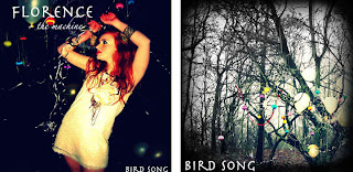
3. Bird Song - Florence and the Machine
This digipack achieved level two in the mark scheme, which is between 4 and 6 out of 10. This digipack actually achieved 5/10. The strengths are that they have their own original images and these relate to the video, which is a good use of intertextuality and they have been edited well to create the querky look that is appropriate to the artist (Florence + The Machine). Unfortunately, what lets them down is the fact there is not a variety of font sizes, and they haven't stuck to the conventions of digipack layouts. They don't have a clear track list unlike the digipacks that achieved level 4. They also don't have the essentials such as a barcode etc. The image of the character (or singer), is duplicated or certainly very similar, the distances have just changed. This means there isn't as much originality as the same idea has been used for two sides of the CD. That is why we don't want to duplicate any images on our digipack. The fourth face (bottom right) also isn't very creative or original, it is just black background with the words "Tweet, Tweet, Tweet."


No comments:
Post a Comment